New feature
Preview your site on mobile, tablet and desktop
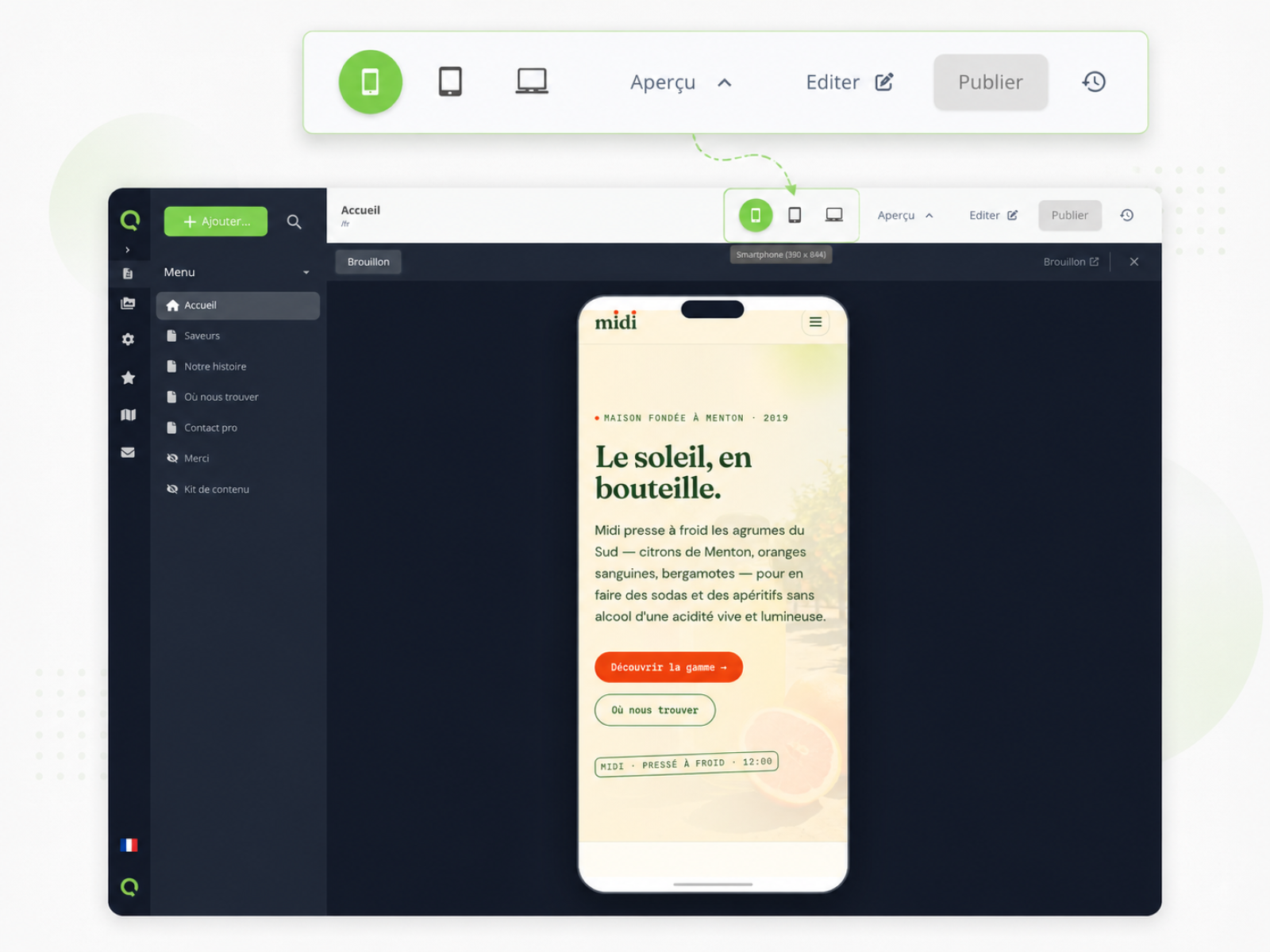
A responsive preview built into the CMS with mobile, tablet and desktop frames — no more back-and-forth with your browser's dev tools.
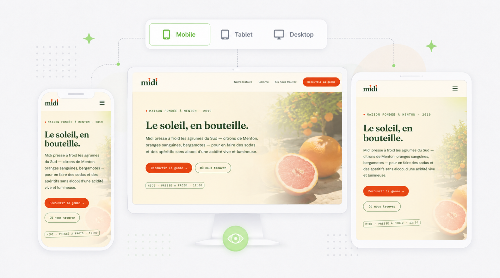
Testing how your pages render on different formats is now part of the CMS.
From a page preview, you can switch between mobile, tablet and desktop in one click. Each format displays the page in a frame with realistic dimensions — you immediately see if a heading gets cut off, if an image overflows or if a button lands awkwardly on a small screen.